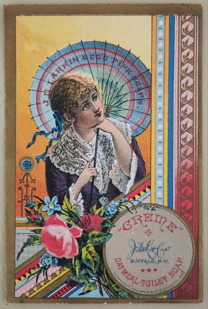
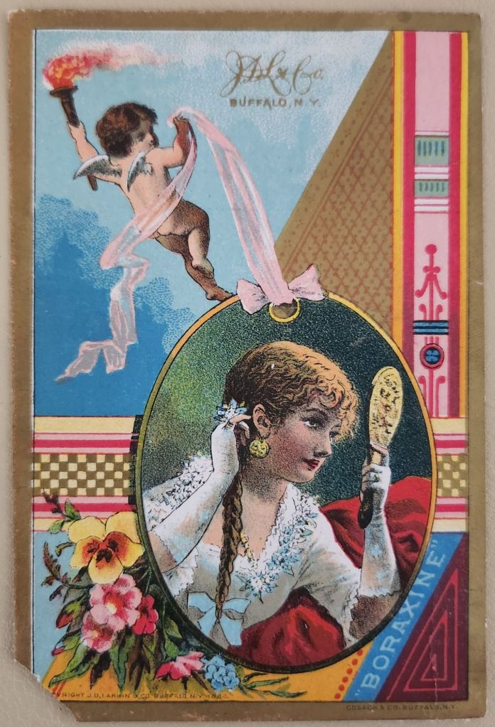
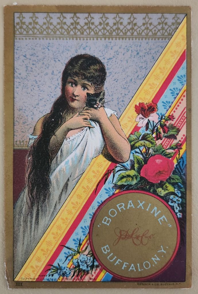
These three Victorian trade cards were issued in 1882 by J.D. Larkin & Co. of Buffalo, New York, and printed by Cosack & Co., one of the most accomplished chromolithography firms in the country at the time. Two cards advertise Boraxine, a borax-based laundry powder; the third promotes Creme Oatmeal Toilet Soap. Premiums slipped into product packages, these trade cards were designed to be collected.
Though selling soap and cleaning powder, none of the three shows domestic labor. Instead, each presents an aspirational female figure representing a Victorian version of beauty, cleanliness, and high design. The cards are notable for the printing mastery, expensive gilding, and their confident use of Aesthetic Movement and Japonisme design conventions.
Both the Larkin Company and Cosack & Co. went on to significant histories. Buffalo’s industrial power in that era were remarkable, and the craft of chromolithography was at its height. The cards survive as evidence of the Gilded Age and still hold their value a century later.
Chromolithography had transformed commercial advertising in the decade following the Philadelphia Centennial Exposition of 1876. The technique required drawing each color separately onto a flat limestone plate, then passing the paper through the press once per color, building the image in successive transparent layers. A finished card of this complexity required a dozen or more passes. The result was a depth and saturation of color that earlier printing processes could not achieve.
Cosack & Co. was among the firms that defined the standard. Founded in Buffalo in 1864 by Hugh Clay and Herman Cosack, the firm described itself as “The Most Complete Lithographic Establishment in the United States” and maintained offices in New York, Chicago, Cincinnati, Philadelphia, Pittsburgh, Hartford, and Boston. Buffalo’s position at the intersection of the Great Lakes and the Erie Canal made it a center for manufacturing and commerce. Printing follows industry, and the company produced trade cards, baseball cards, railroad promotions, Civil War memorial prints, and sporting prints.
None of the three cards depicts domestic work. The women shown are not laundering, scrubbing, or cleaning. Victorian soap manufacturers consistently presented their products through images of the comfort and refinement that cleanliness was understood to produce, rather than images of the labor it required. Cleanliness carried significant moral and social weight in this era. Advertising positioned soap not merely as a cleaning agent but as a indicator of respectable domestic life.
Boraxine was Larkin’s second product, introduced shortly after the company’s founding in 1875. Its advertising copy addressed practical concerns obliquely, but the trade cards operated on a different value system. The cards were premium collectibles in the trade card collection craze that preceded postcards. Their purpose was to be kept, collected, and admired as objects themselves.
The collectible strategy belonged to Elbert Hubbard, Larkin’s brother-in-law and advertising partner from 1878 onward. Hubbard recognized that inserting a chromolithograph into a box of laundry powder gave the customer a reason to purchase routinely. The marketing strategy was driven by the collecting impulse and was itself an object that affirmed the class status of buyers.
In 1885, Hubbard formalized this approach into what he called “The Larkin Idea”. Factory direct sales with valuable premiums bundled into combination boxes at the original price of the soap. The strategy transformed Larkin from a regional manufacturer into one of the largest mail-order businesses in the country, eventually employing 4,000 people with annual sales of $28 million. In 1903, Larkin commissioned Frank Lloyd Wright to design a headquarters building on Seneca Street. It was Wright’s first commercial commission, completed in 1906.
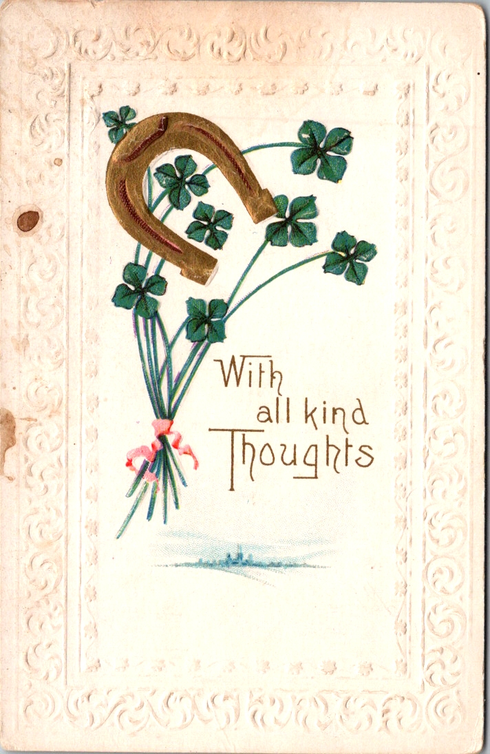
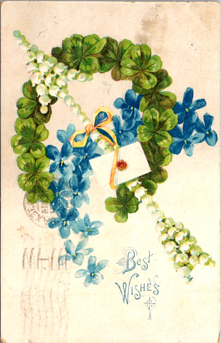
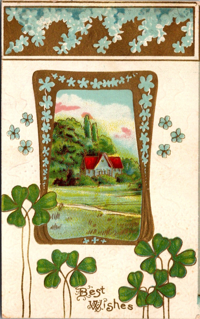
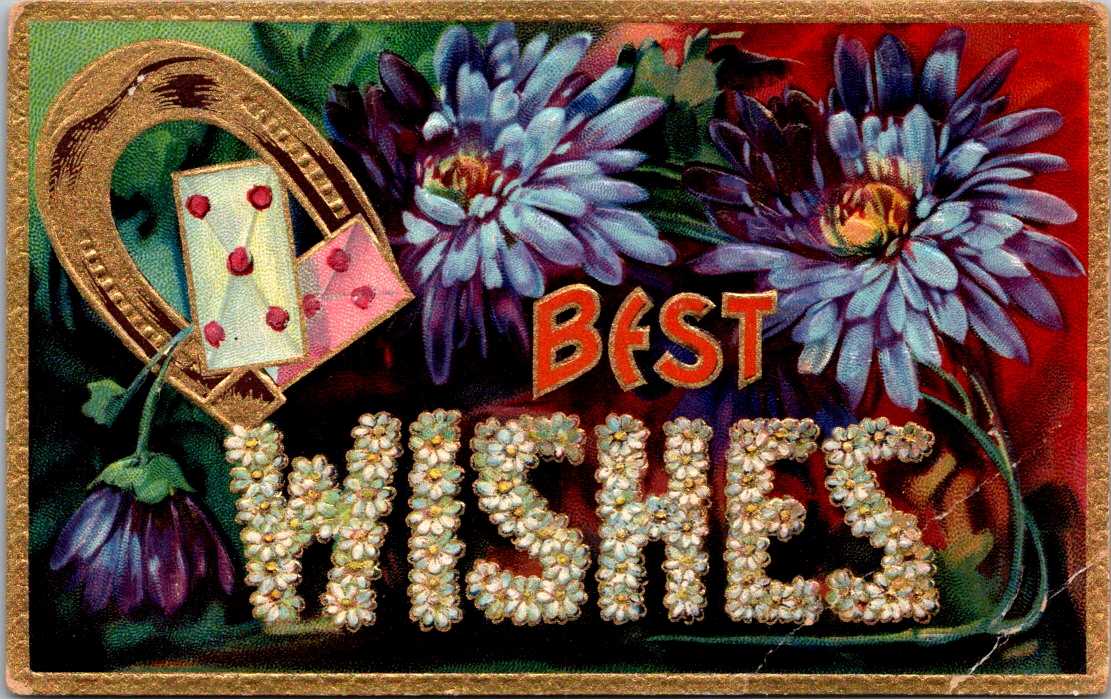
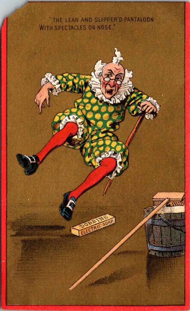
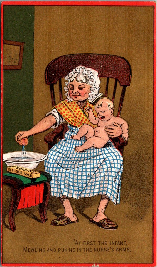
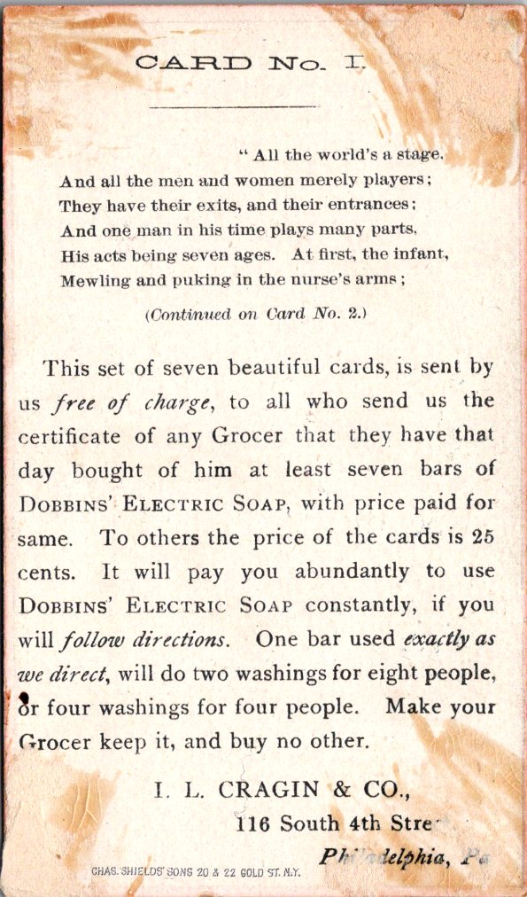
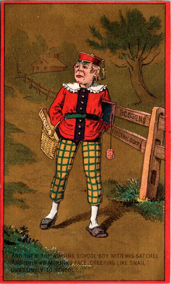
The Victorian trade card era ran from roughly 1876 to the late 1890s, when improvements in magazine color printing reduced the novelty and the format declined. At its peak in the 1880s, trade cards were the most prevalent form of advertising in American commercial life. They were distributed at store counters, tucked into product packages, and carried by traveling salesmen. The collecting culture around them was substantial. Parlor albums were produced specifically to hold them, and publications offered guidance on arrangement and display.
Cosack & Co. continued operating under successive partnerships through the early twentieth century. The Larkin Company closed in the 1940s. Sadly, the Larkin Administration Building was demolished in 1950.
These 1882 cards predate “The Larkin Idea” by three years. The contemporary collecting impulse that Hubbard designed them to provoke also preserved them for more than a century. These three cards survive because they were kept long after the product was gone. They are evidence of a printing firm, a soap company, and a city at a confident moment when quality communication was rightly presumed to outlast its commercial purpose.
To Read More
The Larkin Company — Buffalo Stories Archives offers solid documentation of Larkin’s rise, buffalostories.com
Chromolithography and Trade Cards — The Winterthur Museum holds one of the foremost collections of Victorian trade cards and published research on lithography production, digitalcollections.winterthur.org
The Larkin Administration Building — The Frank Lloyd Wright Foundation maintains records of the 1903 building, demolished in 1950, franklloydwright.org
Borax in the 1880s — The Borax/Death Valley history is well documented at the Borax Museum, Furnace Creek, California, nps.gov/deva
“The Larkin Idea” — The Henry Ford Museum blog tells this story, thehenryford.org
Herman T. Koerner and Cosack & Co. — Western New York History is a good source for more, wnyhistory.org
Trade Cards — A Short History at Cornell University, Waxman Collection, rmc.library.cornell.edu
Robert Jay, The Trade Card in Nineteenth-Century America. University of Missouri Press, 1987.
Jay T. Last, The Colour Explosion: Nineteenth-Century American Lithography. Hillcrest Press, 2005.